I’ve spent the last several years working on multi-user server systems in two different companies. Both those companies had a giant monitor hanging off a wall showing a graph of connected users. It won’t give you detailed diagnostic information, but it is a good indicator for the health of your servers, and your product generally. If you learn to notice certain patterns in your user graph, it can also save you precious time when things go wrong.
Assumptions
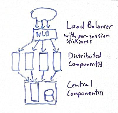
The patterns I’m describing assume a common architecture: you have some boxes in the front that have your traffic balanced between them, and some stuff behind them that’s not balanced. For the purposes of this discussion, it doesn’t matter if it’s one or more apps in the front, if you have a service tier, or what kind of data storage you use. Anything that’s redundant is going to be called distributed, and anything that’s not is going to be called central. You need some way to track user sessions, and the ability to detect disconnects within a few minutes. Some of these graphs also depend on a load balancer that’s configured to keep a single user session on the same distributed server.
Healthy
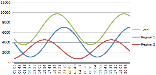
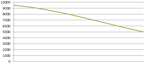
This is how a healthy system should look. I’m showing two views, one broken into a couple regions, and another just showing the total within a shorter time span. It’ll be a lot easier to show these patterns on the zoomed in graph, so I’ll use that as a base line for the following examples.
I was surprised when I first saw the smooth wave-like pattern a connected user graph makes. These examples are a pure sine wave because it was easy to produce, but it’s pretty close to what I’ve seen on real systems. The waves might get a little higher and wider on weekends, but it’s always a smooth line when things are normal.
The numbers and data shown are totally fabricated, and do not represent any of the systems I’ve worked on. My focus here is on the disruptions to the lines. I have observed all of the patterns I’m showing in real production environments, some of them numerous times.
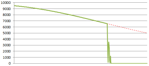
Central Component Malfunction / Failure
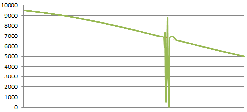
This is the worst case for a server system, and as you can see, the results are drastic. You can tell it’s a central component because the number of connected users drops very close to zero. You’ll also note that I show the connected users shooting back above the norm. This happens when users try to reconnect once or multiple times when the system becomes unresponsive. This is a pattern you will notice during most malfunctions.
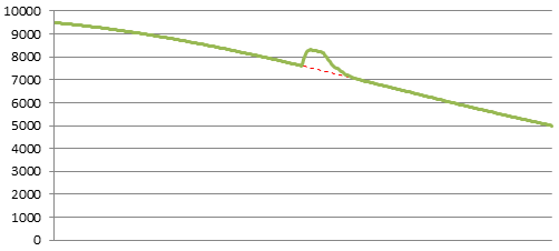
Distributed Component Malfunction
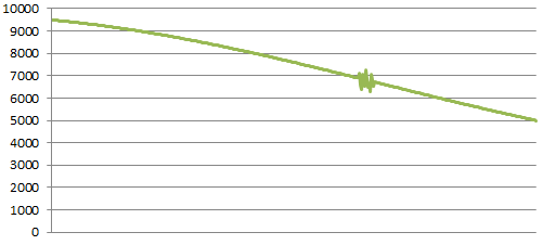
This is a much more common occurrence in a server system; a server starts to malfunction without losing the ability to respond to network traffic. The load balancer doesn’t detect a failure, but users have serious trouble using the app. You will see a serious fluctuation in the graph as users start disconnecting and reconnecting, slowly getting pushed to new working servers. This is one of the reasons why it’s important to have sticky sessions on your load balancer.
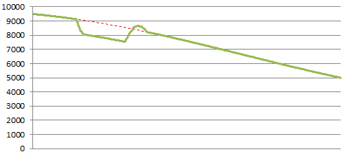
Distributed Server Failure
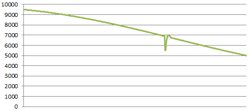
When one of your distributed servers fails outright, you see a much more sudden gouge, but proportional to the number of servers you have. The graph returns to normal fairly quickly once the load balancer detects the bad server, and users finish logging back in.
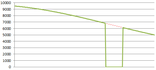
Application Overloaded
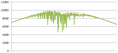
Performance limits can be distinguished because they get worse as the number of connecting users increases. This example shows a hard wall, but the severity you observe will depend on how your system is breaking down. The key indicator is the subtle twitching that gets progressively worse as the pressure builds. The deep downward spikes occur as various parts of the system start throwing large quantities of errors.
Central Component Performance
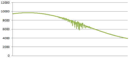
This is what it looks like when a central component starts to have a performance issue. When it occurs off peak, it’s a good clue that some critical system is acting up. If it’s not obvious what’s wrong, here are a few things you can check: failed hard drives in your storage system, hardware errors in your system logs, unusual latency with a heavily-used APIs, or perhaps someone is running an ad-hoc query on the production database.
Denial-of-Service Attack
Denial of Service attacks are awful, and unfortunately effective things. They look different than network gear failures because attackers have trouble ramping up load generators quickly. Once they do get going though, your networking gear will usually start failing, and nothing will get through until they stop. Most DOS attacks are network-level, so you shouldn’t see increased activity or connections before or during the attack.
Television Ad
Advertising should increase your number of connected users. If your ad hits lot of people at the same time, such as a TV ad, you’ll see a bump like this. There will be a spike just as the ad airs, a bit of hang time, then it starts to trickle down to normal. The size of the bump will depend on the effectiveness and reach of your ad.
Television Event
This is one of my favourite patterns. This is what happens if there is a big event that your audience is interested in. An example would be a sports site during the Super bowl. You see a dip while it airs, then you go back to normal when it ends. If people don’t like the event, the line might start returning to normal sooner.
Monitoring Failure
A flat line like this is almost never real, except maybe during deliberate maintenance windows. If it’s not obvious why you’re flat, you should check that your monitoring and graphing systems are collecting data correctly.